Designing a website for a pediatric dental practice is unique in that the target audience is not the patient, but the parents of the patient. And when it comes to choosing a healthcare provider for a child, parents are going to take the search even more seriously than when choosing for themselves.
This means your pediatric dental website needs to appeal to them on an emotional level, they need to see right away that they can trust you to care for their child and that pediatrics is your specialty.
How can you accomplish that? Here are some of the critical elements that will convey to your audience that you are the right pediatric dentist for their family:
- Show them they’re in the right place
 When a person searching for a pediatric dentist visits your website, they need to know right away that you are a pediatric dentist. A cold, clinical website design is not going to say, “We treat kids” and could turn visitors away.
An effective pediatric dental website design is going to show happy children, your target demographic. It may use bright, fun colors and create an overall sense that your practice is a place where children will be comfortable and treated with care.
If your website has images of adults, website visitors will assume you treat adults, regardless of your practice name or what your site content says. In fact, they may not even get to the point of reading your content if the images send the wrong message.

- Earn their trust
Trust is important no matter your specialty, but even more so when trying to convince parents to choose you as the dentist for their child. One of the best ways to earn the trust of your website visitors is with photos of you and your staff. This transparency – showing them before they ever visit your office who you are – instantly increases your trust factor.
Invest in professional photography for your website. Get a nice headshot taken in which you look happy and approachable, and have the photographer take photos of your office and staff for the About Us page. For more guidance with photos, read 7 Tips for Better Dental Practice Photographs.
Social proof is another way to earn trust. What better way to tell parents how great your practice is than with testimonials from other parents who love your practice? If testimonials are allowed in your jurisdiction, be sure to have a testimonials page and ask current patients if they’d be willing to write up a review to use on the website. (Make sure you get a signed release to comply with HIPAA requirements.) You can find more information on social proof here.

- Quality content specific to your specialty
Content is the most important factor in getting new patient conversions from your website. The content on a pediatric dental website needs to speak to the parents. Again, anything too cold and clinical will not appeal to them when making an emotional decision for their child.
Because effective website content is an art and science, we always recommend having your content professionally written by a person or company that specializes in your industry. Pediatric dental content needs to showcase that pediatrics is your specialty and reassure parents that your office is a safe, caring one that their kids will love.
In addition, the content needs to be search engine optimized so that parents can find your website. Are more parents searching "pediatric dentist" or "children's dentist"? Keyword research is a crucial first step in the content creation process and something that a professional content and web development team, like Smile Marketing, would do for you.

Example of a Great Pediatric Website Design
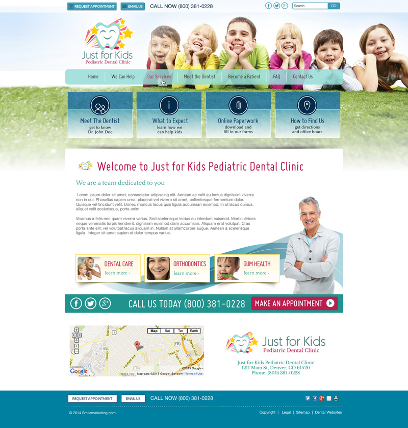
Take a look at the example below from the Smile Marketing design gallery. You’ll notice the image of happy, smiling children, a colorful design, and a photo of the dentist right on the home page. The menu and button text speaks to the parents with phrases like “We Can Help,” “Meet the Dentist,” and “Learn how we can help kids.” The website is welcoming and it is clear that this practice is especially for children.


