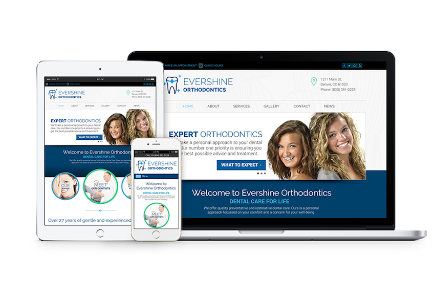
 Countless online ads and endless pages of search results have trained people to decide whether or not they like a website the moment they land on it. An outdated dental website can be a major turn off to both existing and prospective patients.
Dated web technology may not only prevent your dental practice website from being found online (due to structural and technological issues), but also discourage users from exploring further once they land on your site. Dated web design can actually become a negative commentary on your clinical skills, as it tells prospective patients that you’re not quite “keeping up.”
By avoiding these common design and marketing pitfalls, you can create a user-friendly website that is attractive, easy to navigate, and primed for new patient conversion.
Is Your Site Mobile-Friendly?
One critical component of modern web design is the “mobile-friendliness” of your site. Why should your site be mobile-friendly? Well, consider this: Over half of online traffic now comes from mobile devices and through mobile applications. For many people, mobile devices have become a substitute for desktop computers. So when it comes to researching dentists in their area, more and more people are doing so on tablets and mobile phones.
Furthermore, whether or not your site is mobile-friendly is now a ranking factor in the eyes of Google – meaning, it affects how high your site will rank on the search results page when someone performs a search from a mobile device.
The best way to get your site mobile-friendly is by upgrading to “responsive design.” Catering to each individual user, this design technology adjusts the way your site displays automatically for optimal viewing on any type of device (desktop, mobile, and tablet).
A responsive design is able to identify the operating system and screen resolution of the device that is accessing your site. In doing so, the website intelligently delivers the text and graphic elements of the page targeted to that particular device. That way, if someone accesses your site on a mobile device, they won’t have to zoom in or out to read content or navigate from page to page.
Tip: Test this out right now on our site by dragging the side of your browser to make it larger and smaller. You’ll see the text and graphics automatically realign!
Other Signs of Outdated Website Design
In addition to having a website that is responsive across all devices, you want your site to be both functional and engaging. Consider these common website perils:
 Not interactive: The goal of your website is to get visitors to take action. If they are unable to contact you, set up an appointment, or engage in some form of conversation, your site won’t be converting many new patients.
- Too promotional: Excessive pop-ups and too many offers can make a bad first impression. Most people visit websites to fulfill a need, not be distracted with too much self-promotion.
- Broken links: One of the biggest visitor deterrents on any website is to have “404: Page Not Found” messages and other errors all over the site. A dysfunctional dental practice website will limit the amount of visitors that actually convert into new patients. Scan your website on one of the many free online resources to identify any broken links.
- Dated formatting: Attention spans are dwindling. Pages with huge blocks of text are going to send your visitors running. You want easy-to-scan copy that will keep readers engaged with your content.
- Date-sensitive content: Events, promotions, holiday hours, and other content relating to past occurrences shows patients you aren’t maintaining your website. So whenever adding date-sensitive content to your site, be sure to set yourself a calendar reminder.


