Optimizing For New Patient Conversion
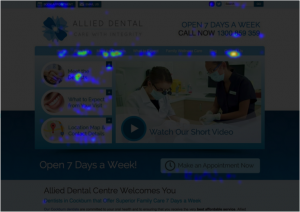
One of these tools is something called heatmapping.
A heatmap, in a digital marketing context, is a visualization map that allows marketers to monitor where and how visitors navigate a website. The most used sections of a page are typically shown with dark red, with less viewed/clicked parts of a page displayed as blue, green, yellow, etc.
The three main insights we can monitor are:
1. How far visitors scroll down a page
2. Where visitors click on a page
3. Where visitors move their mouse or finger (if on mobile) on a page
 So, what can we do with this data?
While we have over a decade of experience building conversion-friendly website designs (which has provided data on what does and doesn't work), each individual practice is different.
Therefore, strategies can vary from one dentist to another. How users interact with your practice website can impact key design elements. For example:
If users aren't scrolling very far on a particular page or are abandoning at a particular point, we might want to adjust the content on that page. After reviewing the heatmap, we might want to reexamine the content, rearrange images, and adjust where we place calls-to-action (i.e. "Schedule an Appointment").
Other variables we can learn from our conversion optimization tools are:
- Which headlines draw visitors and encourage them to click
- Which images attract the most attention (you might be surprised how many people click on un-clickable images)
- What page elements seem to distract visitors from your core content
- Whether visitors are seeing your CTA buttons
We A/B test crucial conversion variables to keep your website optimized and converting new patients.
In essence, it's not a set-it-and-forget it strategy. It's an ongoing optimization process to ensure that your website is operating to its fullest ability.
