In the ever-changing world of the Internet, your dental website has a limited lifespan. Technology and design trends change so rapidly that after only a few years your website goes into decline. With a shelf life of only three to five years, it’s important to know the signs your website is due for a redesign.
Here are two essential reasons why you might need to get your redesign plans off the ground.
1. Dated Aesthetics are an Instant Turnoff
The average Internet user visits 89 different websites per month. That’s over a thousand per year! Think a prospective patient won’t notice an archaic design? An old website design can in fact reflect poorly on your clinical skills. After all, if you’re not keeping up with your website, what else aren’t you keeping up with?
Particularly in competitive jurisdictions, a website must be redesigned frequently to capture visitors’ attention. If left untouched, prospective patients are bound to look elsewhere.
Large glasses, floppy hats, bell bottom jeans, you name it. Remember when so-called “portable” phones could only be used in vehicles? Whether we realize it or not, the Internet is no different from any other trend or technological change. We’ve naturally become accustomed to improved website design.
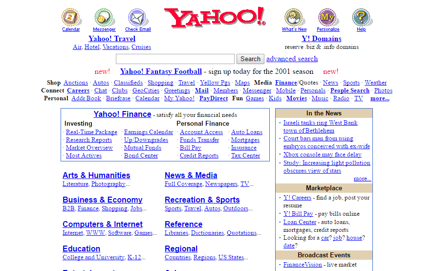
Here’s a snapshot of Yahoo.com during its prime:

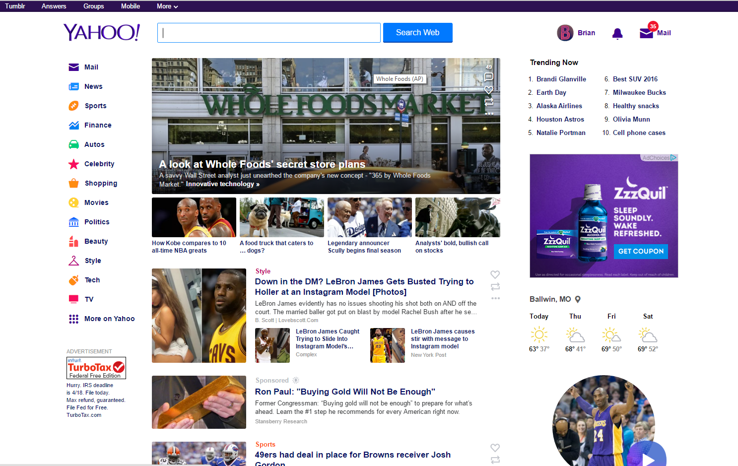
This is what it looks like today:

Notice any changes? You might observe that today’s version of Yahoo.com:
- Has a more modern feel
- Contains engaging photos
- Is less text-heavy
- Is easier to navigate
Understanding the more technical innovations of a website is also important. Coding, for instance. Innovation has shifted from Flash technology in favor of HTML5. This is big in the mobile space as device providers have opted for HTML5 as the future.
Flash is a software technology for creating interactive web applications like websites, movies, and games. Using Flash rather than HTML5 could make your site inaccessible for prospective patients trying to access your site on a mobile device. It can even pose problems on desktop computers, because Flash is known for having many different versions and security vulnerabilities.
2. User Behavior Is Constantly Evolving
 Equally important as the general aesthetic of your website is whether your site caters to the modern user. The way people use the Internet today is far different from how they used it only a few years ago.
For instance, social media has shortened attention spans. Twitter limits status updates to a mere 140 characters. Facebook status updates are often just as brief. While forcing users to scroll too far down a page used to be taboo, people now scroll through their Twitter and Facebook feeds all throughout the day.
Shortened attention spans have changed the way in which webpages should be formatted. Long gone are the days when a visitor is willing to read through a labyrinthine of pages containing endless blocks of text. Instead, your pages should:
- Have brief paragraphs and headings to improve readability
- Have at least one image to space out the text
- Have unique content that showcases your practice personality
Another critical factor of a modern design today is mobile-friendliness. If your site isn’t mobile-friendly, the user experience for those using smartphones and tablets is greatly reduced (and more than 50% of Internet searches are now done on mobile devices). It’s critical that your website is responsive to any device. If it’s not, you’ll be seen as behind the times and lose prospective patients
You have a matter of seconds to gain a visitor’s attention. If you’re too late, prospective patients will be sailing on to one of your competitors. You must keep visitors on your site long enough that they’ll be convinced to pick up the phone.
If your website is over five years old, there’s a good chance that’s not happening.


