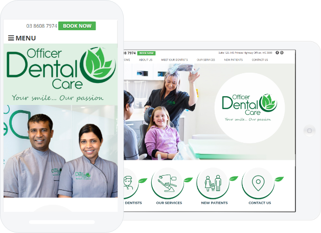
The first post in our Essential Components of Dental Website Design series looked at the call-to-action and the role it plays in turning visitors into new patients on your practice website. In this week’s web design post, we’re going to discuss the importance of practice branding and what you need to consider when designing a new practice website.
Website Design Reflects Your Clinical Skills
It's important to first remember that you have a brand. In fact, you are the brand. And your dental practice website needs to advance your practice branding.
Proper branding communicates consistency. Consistency in branding and identity translates into the all-important element of clinical consistency. In other words, consistent branding elevates your clinical reputation in the eyes of patients and prospective patients.
Your branding is the first impression a prospective new patient gets of your practice — whether it’s the sign in the front office, your business card, or your website — and it needs to accurately reflect the focus and tone of your office. It is what sets you apart from your competitors on a surface level.
Set Your Practice Apart
Do you want to blend in with the crowd? Probably not. That means that your branding needs to be:
- Visually appealing
- Contemporary
- Unique
Make sure to set yourself apart from your competitors. Then, once you have established your brand, be consistent in all things—colors, font, logo, tagline, etc.
Make sure your business cards, letterhead, invoices, and practice signage all have the same look and feel. Carry that look and feel onto your Facebook banner and email headers. It may also be time to drop that "dryourname@aol.com" email address in favor of "dryourname@practicename.com."
This is how locals get to know you. This is how you start to solidify a place for your practice in your community and build brand recognition.
And consistency with your branding on your practice website reassures visitors that they’re in the right place. Imagine that a prospective new patient gets your business card from a friend. They go online to check out your website and it looks nothing like your business card—different logo or colors or tagline. This could cause confusion and send them away thinking they’ve arrived in the wrong place.
It goes even further than colors and font, though. Your overall brand message needs to be consistent. Sending a reliable core message in all your branding will help your practice gain trust within your community.
Time to Update? Free Dental Website Design Checklist
If you’re embarking on the journey of building a new dental website, it may be a good time to ask yourself if your current branding is sending the right message. If your logo is outdated or you’re not completely happy with your current branding, take this time to consider a redesign.
Once your practice branding is solidified, you can effectively convey your message to your website designer so that your site design accurately reflects your practice.
A great dental website designer will be able to create a website that embodies your branding, is contemporary, inviting, and optimized for new patient conversion. These attributes will give your site an edge over your competitors’ and encourage your website visitors to select you as their new dentist.


