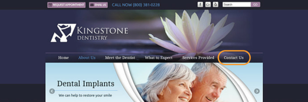
It might seem strange to consider contact information a website design element, but your contact info is so important that it must be deliberately placed within the design of your practice site.
If you have a great dental website that has strong content and calls-to-action, your website visitors will want to contact your office. It’s important that your dental website designer incorporates your practice phone number into the design using the same science that guides overall layout design.
Don’t Make Me Think
 If you have a prospective patient on your website who is interested in scheduling an appointment, they should be able to easily.
One of the quickest ways to lose a potential new patient is to make it difficult to contact you. And if a website visitor is serious enough about seeking treatment with you, it’d be a shame to lose them simply because they couldn’t find your phone number.
All the hard work was already done!
Does this mean you need to plaster your practice phone number all over the site? No.
It does mean, however, that you need to know how users interact with websites in order to ensure your contact information is where they think it should be.
That means:
1. Above the Fold
Your practice phone number needs to be clearly visible on every page of your website in the user’s browser window without scrolling down. Typically this means in the header.
A popular, conversion-friendly design includes a “sticky” header that stays at the top when the visitor scrolls down. It ensures the visitor can easily find your number without being too intrusive (i.e. pop-ups or contact info on every other line).
2. Menu Bar
When you are looking for specific information on a website, where do you look first? Odds are it’s the menu bar. Make sure you have “Contact Us” in the main menu bar since people are trained to look there.

The Contact Us link should take them to a contact page with your practice address, phone number, a contact form and/or email address, as well as a map and directions to the office. You may also want to include a photo of the exterior of your office so new patients know what to look for when they come for their first visit.
Tip: Also include your office hours on this page. That way when a prospective patient calls, they already know your basic availability.
3. Meta Description
The meta description is the snippet of text that appears beneath your website title in search results. Include your phone number here so that patients don't have to go to your site just to find your number.
When someone clicks to your site, jots down your phone number, and leaves right away, Google considers this a "bounce." A bounce signals to the search engines that your site is not engaging and too many bounces can negatively impact your rankings. Avoid unnecessary bounces by adding your contact info to your site's description tag.

When Creativity is Not Encouraged in Dental Website Design
When it comes to your contact information, there is no reason to get creative. Placing your phone number in a fancy font in the middle of your sidebar is not going to get you more new patients. In fact, it could prevent a prospective patient from seeing it at all.
Stick to the best practices mentioned above for placement and use an easy-to-read font. Emphasize the phone number a little more with a “Call Now” button or a phone icon:

The placement of contact information should not be an after thought, it needs to be part of the original design and optimized for user experience to maximize the new patient performance of your site.


