What Makes a Great Dental Website?
When it comes to attracting new patients, your dental website design should do more than just look good. It needs to effectively communicate your value, demonstrate your expertise, and cultivate trust in the website visitor (a.k.a. prospective patient).
Already this year, we’ve seen many brilliant dental website designs that do just that – they’re designed to attract the dentist’s ideal patients, ease fears, and authentically represent the practice.
Read on and get to know Smile Marketing’s top dental website designs of 2023 — and discover the key elements of a dental website that turns visitors into new patients.

1) Attract Your Ideal Patient
A generic dental website design looks like it could belong to anyone. You're not just anyone! You're a caring dentist with a unique approach to care.
Does your website reflect that?
With a high-converting practice website, patients immediately know whether a dentist feels right for them. They can see it in your photos, your branding and your persuasive website content. They don't have to think about clicking the "Book Now" button – they just do it!
Your dental practice has a unique audience, whether it's families, seniors, or people who fear visiting the dentist. Your website design should tell prospective patients, "We get you!".
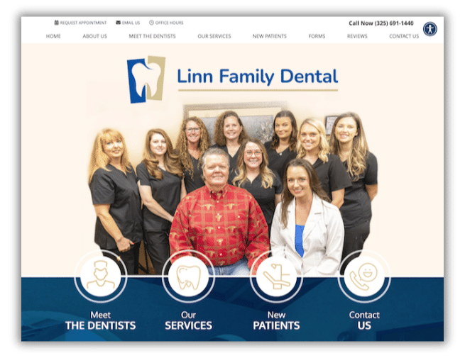
Example: Linn Family Dental nails it. Specializing in dental care for the whole family, their website connects to patients with soothing colors, joyful smiles, and custom content tailored specifically to parents seeking top-notch care for their little ones.
2) Unleash Your Practice's Personality
The best dental websites feel like an extension of your practice. From the tone of your content to the colors, fonts, and images you choose, showcase your practice's unique personality to attract your ideal patients and prepare them for what to expect when they walk into your office.
Example: Sea Brite Dental is all about making a trip to the dentist enjoyable! With a calming color palette, ocean-inspired design elements, and photos of their friendly team, this website puts their personality front and center, making prospective patients feel at ease.
3) Soothe Away Dental Anxiety
No more dental anxiety! Your website is your secret weapon to calming fearful patients. Create a digital haven that's warm, welcoming, and reassuring. Explain treatments clearly, emphasize your patient care philosophy, and let smiling photos melt their worries away.
Example: Good Morning Dental creates a soothing retreat. With tranquil colors, photos of comforting dentists and smiling patients, and a compelling special offer, your website can help patients wave goodbye to their anxieties so that they can focus on a healthy smile.
4) Keep It Real, Be Authentic
Authenticity wins hearts. Patients want to know that you're a real person who genuinely cares about their health. Showcase your team, share your passion, and let glowing testimonials tell the world how you change lives.
Example: Childrens Dentistry Group captures the essence of real connections. Genuine photos of a caring team, content that speaks directly to patients, and an engaging, uplifting social media presence form an authentic, trustworthy website experience.

Top Dental Website Designs of 2023
Grande Promenade Dental
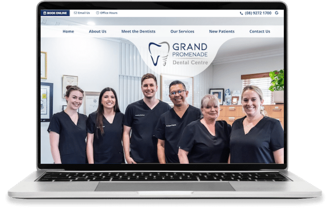
Grand Promenade’s website transports you right into their office with their gorgeous professional photography. It welcomes patients with open arms through captivating photos of the dentist, staff, and clinic so patients know exactly what to expect on their first visit.
Kinross Drive Dental
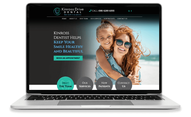
Kinross Drive Dental's website has a sleek, modern design with a high-end look. The photo choices, plus the refreshing color palette with pops of blues and teals, create an atmosphere of tranquility.
James Island Dental
The James Island Dental website leverages custom professional photography, rich shades of green and an extended menu to draw attention to their full selection of dental services. Patients can see for themselves how friendly and professional the office is and easily find the treatment option they’re looking for.

Build The Best Dental Website For Your Practice
Your dental website is your ultimate tool for attracting and retaining patients. Craft a user-friendly, informative, and undeniably unique online presence that perfectly represents your dental practice.
Schedule a no-obligation Discovery Call today and learn how we can make your dental practice shine online.
BOOK A DISCOVERY CALL


