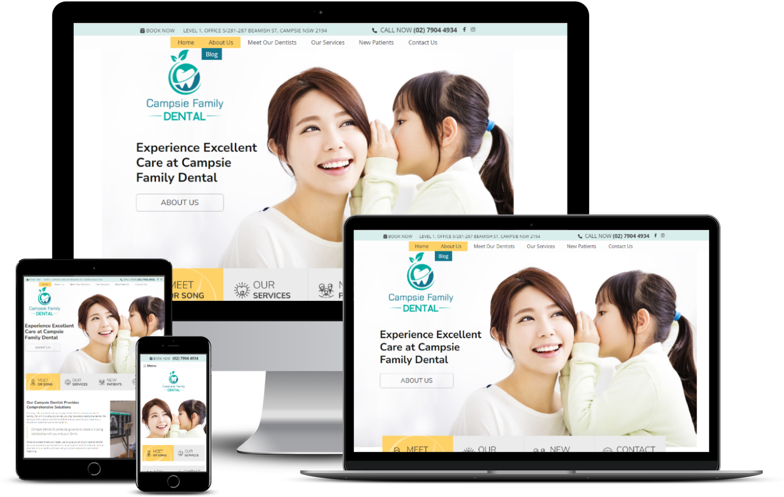
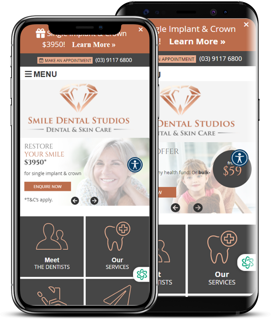
Responsive Dental Websites
With over 55% of patients viewing your website via mobile phones and tablets, your practice website needs to look amazing on all devices.
That’s why all Smile Marketing websites are responsive.
How Does Responsive Website Design Work?
Having a responsive website design means that your practice website will adjust its layout and content to look good on any device (mobile phones, tablets, or desktops) ensuring easy reading and navigation for prospective patients.
A mobile-responsive design ensures your website is easily navigable and readable on any device, providing a smooth user experience. For a dental practice, this means patients can easily find information on your services, schedule appointments, and contact you.
Improved Search Engine Rankings
Google favors mobile-friendly sites. A mobile-responsive website is more likely to rank higher, therefore increasing your online visibility and attracting more traffic to your site.
Increased Conversion Rates
Mobile-responsive websites engage users better, reducing bounce rates and encouraging more inquiries, patient calls and bookings.
Get Your Personal Plan Recommendation
Every practice is unique, and so are its digital marketing needs. Take our quick plan pairing quiz to get matched with the Smile Marketing dental website and digital marketing plan that will help you meet your specific practice goals.